Wednesday, February 29, 2012

CGR 231: Termina map CGR 232: Funny video

CGR 231

Zelda Majora's Mask Map


The map was designed like what our maps would show. There was alot of time planed into making the layout. There are 5 different spots each with a different type of terrain. There is a forest, swamp, ocean, snowy mountains, and a mountainous gorge.

CGR 232

Zelda movie


I thought this was a funny video that looked like it had a bit of rotoscoping. The people who came up with this idea really planned it out. The health and magic bars actually look like it was taken directly from the game itself. Also, the way they had the money gage increase was timed really well.

Tuesday, February 28, 2012

Examples for music

CGR 231

Mario 8 bit music


The music is simple and loops continuously. The tempo stays the same.

CGR 232

Zelda 16 bit music


The music is really odd. It sounds like an orchestra. I hear drums, some violin type of instrament, what sounds like a banjo, and a xylophone. This music sounds tribal.

Monday, February 27, 2012

CGR 231: Spore CGR 232: 8 bit

CGR 231

Spore


Spore is a game were alien life forms grow and expand to their surroundings. The game is excelent because you can create the alien race however you want. Then you control its race for different eras. The downfall is that there are limited parts to use for the alien.

CGR 232

8 bit Zelda music


Zelda music sounds more techno when it first came out. I'm not 100% sure if its techno because I don't listen to alot of music. It has a high pitch throught the song made by what sounds like some type of flute or piano. Drum beats are small and simple for certain parts.

Sunday, February 26, 2012

CGR 231: SK CGR 232: DS

CGR 231
SWTOR Security Key


The key is a great design. It keeps people from hacking your account because it gives a random number everytime and the key is bound to your account so someone would have to steal it to hack your account. Also, it can be attached to your keyring so you don't lose it.

CGR 232

DS


A DS is designed to be portable and fit in any pocket. They come in a variety of colors so you don't just have the basic black look.

Saturday, February 25, 2012

Collectables

CGR 231

Harry Potter Chess Board


This chess board was made to look like the chess game in Harry Potter. This gives people a similar experience to what wizards would play. Fans can also collect this for their own personal reasons too.

CGR 232

Naruto figurines


The figurines were made for fans to collect. They are in stances relating to the character. Kakashi (bottom right) has his favorite jutsu powered (chidori). They are made of plastic so they have some durability but can still break if enough pressure is added.

Friday, February 24, 2012

CGR 231: Elf CGR 232: SSBB

CGR 231

Elf Archer


This picture is really well made. The costume actually looks like it was made from leaves. Elves are enviromental beings so the leaf pattern clothing is common. The pose gives depth showing his determination and how he is ready when he needs to be.

CGR 232

SSBB Zelda video


This video was created using multiple edits from 2 games, Super Smash Brothers Brawl and Twilight Princess. The video was edited using fight scenes from SSB and their abilities in that game. The scene where ganon dies is from Twilight Princess. The video was put together very well and I didn't see any flaws in the transitions from SSB to TP scenes.

Thursday, February 23, 2012

More logos 4

CGR 231
Pepsi logo


This pepsi logo is different than their current logo. The crystals behind the circle give off that cool feeling like when you have a cold can of pepsi. The red, white, and blue stripes look alot like how our flag's stripes go across it.

CGR 232

Cheetos logo


The cheetos logo isn't that great of a design to me. The type has sharp corners like a cat would, hence the cheeta on the bags, and the color is similar to a cheeta. The problem is that the text is curved and i don't see why its like that. Also, the orange glow around the text is too destracting for me to actually look at the type. There is waisted space below the e's that could of been used to increase the cheeta effect.

Wednesday, February 22, 2012

CGR 231: Dragon CGR 232: LOTR Miniatures

CGR 231

Dragon statue


This dragon is designed very well. The curved tail around the sword gives balance to the piece since the top has all the dragon. The sword plunged into the ground would be symetrical without the dragon. The gradient wings gives off the feeling of power and fire.

CGR 232

LOTR Mineatures

LOTR miniatures game

The miniatures were designed for many purposes. They are made from plastic most of the time so they are sturdy when people use them for games, but they can also just be collectables. They are not painted when made so you can paint them however you like or paint them like the Lord of the Rings characters.

Tuesday, February 21, 2012

More logos 3

CGR 231

Head and Shoulders logo

head shoulders logo

The Head and Shoulders logo isn't that great of a design. The slanted text draws the eye to the end of the page where there is nothing. The oval with the swirls also doesn't make sense with the shampoo name. The blue can stay though because it resembles water.

CGR 232

Lays logo


The lays logo is an eye grabbing piece for all ages. The basic yellow and red gives off the warming, friendly feel. Red and yellow are part of the warm color and people respond to warm colors more than cool colors.

Monday, February 20, 2012

More logos 2

CGR 231
Warner Bros logo


The famous warner bros logo is always changing in minor ways. The parts that don't cange is the badge like shape and the giant W and B in the center. The ring on this logo was added years later and it helped define who's producing the movie or show.

CGR 232

Atari logo


The old atari logo is one that i never understood. Their design was just 2 curving lines with a straight line between them. Its like its rising from the ground but I still never figured out what they were going for.

Sunday, February 19, 2012

More logos

CGR 231

Xbox logo


I like how they designed the Xbox logo. The X in the circle actually goes back in the sphere giving it depth. The green seems a little odd for the logo. It is to light for me. They should of gone with a slightly darker green.

CGR 232

Lionhead logo


The logo uses positive and negative space very well. The curved lines actually make your eye see a lion's head. The thing that looks stupid to me is the head looking off the screen. It makes you wonder what it is looking at.

Saturday, February 18, 2012

Chip logos

CGR 231

Utz logo


The Utz logo is a great design. The sharp lines that the lady is sticking her hand in actually looks like a bag to the eye. The 2 basic colors don't contrast or take away from each other. The U also looks like it streches the squigly lines above it to represent the rest of the bag.

CGR 232

Pringles logo


The Pringles logo is a good design also. The only thing I say could change is the way the man looks. The hairstyle is really weird to me and the bowtie stands out too much. Also, the hair color, to me, stands out from the basic color scheme.

Friday, February 17, 2012

CGR 231: Medieval Clothing CGR 232: Wii

CGR 231:

Medieval Clothing


Medieval clothing was designed differently for the social classes. The more noble blood you have the more elegant and more intricant were the designes. Noble clothing was made to represent your bloodline and was made for comfort. Peasant clothing wasn't comfortable because of the materials they could buy or make with what they had. Peasant clothing also didn't have alot of color. They were mostly browns due to price for dyes.

CGR 232

Wii logo


The Wii logo is very simple type. The type is grey and when animated the i's bow down like people do. The logo could have some type of graphic behind the type to bring out the type more.

Thursday, February 16, 2012

Kingdom Hearts Keyblades and Logo

CGR 231

Keyblades


Keyblades are used but Keyblade Masters in Kingdom Hearts. Each keyblade has a different look. They were designed for certain purposes like added strength or higher luck. Their designs relate to the name gives to their look.

CGR 232

Kingdom Hearts logo


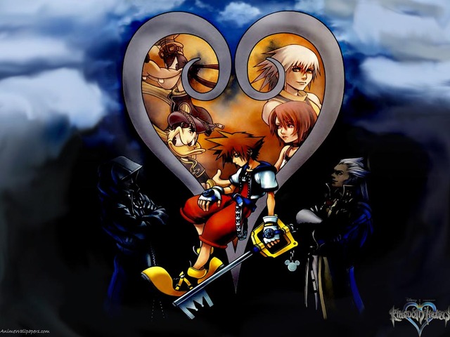
The Kingdom Hearts 2 logo is a great design. Its not too complex but isn't simple. The bolded, gradient text gives asymetric balance to the symetric heart with the 2 blade-like images. All the text curves to points like blades. It helps represent the keyblades that you use.

Wednesday, February 15, 2012

Zelda chars and artifact

CGR 231:

Demise vs Gannondorf


Demise is the god of destruction in the Zelda series. To give him an evil look they added scaly skin that looks like armor, a large black sword that can be electrified, and hair of flames. His upside down red triforce mark on his sword signifies the downfall of his enemies. He said at the end of Skyward Sword that his wrath would be reincarnated upon the return of Link's decedents. They say his incarnation is Gannondorf.


Gannondorf is the king of Gerudos and is completely evil. Like Demise he is portrayed with dark clothing and instead of hair of flames he has redish-orange hair. Gannondorf is as evil as Demise and wishes for the destruction of Hyrule also. They are the same in spirit but most of their looks differ. Most incarnations don't look like the original but their attitude will always be the same so Gannondorf is Demise's incarnation.

CGR 232

Triforce


The Triforce is 3 simple pyramids touching at the edges. The Triforce is the most powerful artifact in the Zelda series. It is said the one who brings all 3 together can get 1 wish. The Triforce is golden in color to represent the 3 goddesses who made the Triforce when they went back to the sacred realm.


Tuesday, February 14, 2012

CGR 231: More music CGR 232: HP

CGR 231

Sanctuary


Another song that I listen to to relax and clear my mind. The slow and calming start gets my mind t relax so i can think more clearly. The song has both soothing and rough bits to help convey its meaning. The meaning is slightly different to everyone but to me it is your innerself where nothing can harm you (your sanctuary of the outside hardships).

CGR 232

Harry Potter


The famous Harry Potter series covers have interesting covers. The Half Blood Prince book cover has that mysterious, ominous feel because of the dark green background with the swirling light green cloud.

Monday, February 13, 2012

Stop motion examples

CGR 231


Interactive post-its


Another funny stop motion example that has an interactive period between post-it and human. The post-its start as a business deadline and then turns to a multitude of thoughts and games. The post-its became a few games but it still ended with the man needing his work.

CGR 232


Rymdreglage 8-bit trip


I thought this was interesting because someone used legos to help represent his 8-bit idea. Rymdreglage shows us the old 8-bit games that were popular like pac man. His color scheme while making the scenes was a perfect choice mainly because they are the primary colors mostly. Kids love the primary colors so this would get their attention, but will also keep the attention of teens and adults due to the switches between action and actual pictures  instead of being all legos.

Sunday, February 12, 2012

CGR 231: Minecraft CGR 232: ORC!!!

CGR 231

Minecraft


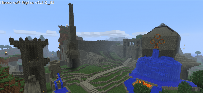
Minecraft is a simple block game where you build whatever your mind can thing of while trying to survive against creatures of the night. People have created many things in minecraft ranging from cathedrals to copies of characters like Mario. Since it is simple blocks the design field is very simple and easy to create.

CGR 232

LOTR Orc


Creating Orcs in Lord of the Rings is a very long and difficult process. Designing these hellish creatures takes time and lots of planning. They need to figure out how tall they should be and what they would look like due to their background and where they grew up. This type of design isn't recognized like it really should because people look forward to the movie more than how it was put together or the planning behind the masks.

Saturday, February 11, 2012

Perspective examples

CGR 231

Perspective


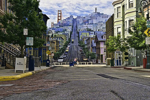
A good example of perspective of a road. I am going to make a road similar to this, but it might not have the buildings, so my person can walk down the street and look like he is going back in space.

CGR 232

Sonic Unleashed


Sonic is another one of those games that became popular from its 2-D games. This on was made with more recent technology and is a good example of perspective. The path he is on looks like it turns to the righ like we would see in reality, but the game is really a 2-D model with an illusion to make it look like it goes back in space.

Friday, February 10, 2012

More scene transition examples

CGR 231

Starcraft 2 Trailer


The scene cuts at the beginning are slow fades like a memory. Later the scenes become direct cuts at fast intervals. The action is put between cuts to keep your attention on the trailer.

CGR 232

SWTOR Trailer


The scenes are basic cut scenes with few fades. There is action throught the video so people won't want to look away. There is a slow motion scene, but it adds suspense to the action to have some variety.

Thursday, February 9, 2012

Perspective

CGR 231

Perspective


I want to try to make a road with words using perspective. This image gives an idea of how to use perspective.

CGR 232

Perspective video


This isn't a real person walking from the background, but it still shows an example of how to make perspective walking.

Wednesday, February 8, 2012

Movie help

CGR 231

Map idea


The famous remake of Zelda fans favorite game Ocarina of Time. The map flashes for what room you are currently in. My map will flash for your current room too.

CGR 232

Skyward sword


The transition from one scene to the next are slight fades that don't fully fade out before the next scene starts. I should use this idea for a video I make in the future. The last teansition is a direct cut to the black screen with the game title.

Tuesday, February 7, 2012

CGR 231: SC CGR 232: Power

CGR 231
Zergling


Of all creatures made in video games nothing is as gross as the Zerg. These parasidic creatures are a horrid site. This is an exact replica of what a zergling would look like. The picture gives full detail with the slime and spiky, leathery look. This picture was designed very good and gives off its horific, deadly side.

CGR 232

Naruto


The blood red swirlling energy surrounding Naruto shows anger and power. The black and grey background gives off an evil feeling and Naruto's facial expression enhances the evil intent behind him.

Monday, February 6, 2012

Ideas

CGR 231

Kinetic type


The kinetic type video helps me plan a way to make my idea work. The slow text allows people to read what is said and moves around to give eye interest. This example shows me what slow text does but I will most likely have faster text.

CGR 232

Stop motion


Tony vs Paul is a funny example for stop motion. I can see all their hard work in making this. They had to continuously jump for scenes that they were in the air. My idea I had for a stop motion won't be like this, but it will have some similar shots.

Sunday, February 5, 2012

Game changes

CGR 231

Super Mario World


Older games were made with brighter colors. The graphics were also lower tech due to having little knowlege and programs. The character was designed with just a few motion graphics to make it seem like it moves. The background was flat, but usually had something to represent where and when it took place. Like this Super Mario game screen the level was in some oped mountainous field. The mountains were odly shapped due to the graphics.

CGR 232

Zelda Skyward Sword


The design of games improved dralastically over the years. Now they can look realistic. Skyward Sword is a more cartooned version of the games that can be made. The design of the characters are now more menuverable. The characters are made with polygons and move according to what command you use. The background design is similar to the old games by the use of when and where, but the background isn't flat or square/oval now.

Saturday, February 4, 2012

CGR 231: LOTR CGR 232: SW

CGR 231

Lord of the Rings


The diagonal lines from the sides of the picture draw your eye to the middle to see the ring. The red and black colors surrounding the ring makes it evil and corrupting. I say this is an effective way to express evil by the color scheme and the focal point being expressed with the movement of the diagonal lines.

CGR 232

Star Wars


The sith and the jedi clashing gives the facial expressions of one wanting to defeat the other. The angle made from the lightsabers lets your eyes see the background and the people standing by the crash site. The site is a battle and the dark background helps emphasise it.

Friday, February 3, 2012

KH wallpaper and music

CGR 231

Kingdom Hearts

Kingdom Hearts Anime Wallpaper #7

Setting Sora to the foreground makes him the primary focus. Also, with the bright colors not dulled down on him it makes his seem like the lonly hero looking for his friends in the heart. The darkness and people wearing black gives the effect of the darkness that needs to be overcome.

CGR 232

Simple and Clean


Simple and Clean by Utada Hikaru calms my mind to help me think straight. The calming music lets my mind wonder around and see shapes around whatever room I'm currently in. Upon looking at these shapes I draw lines in my head and connect them trying to make some object to appear to inspire me.

Thursday, February 2, 2012

CGR 231: Link's Swing CGR 232: Medieval design

CGR 231

Zelda Wallpaper


The blue striek that goes around Link gives the effect of the sword swinging around him. The diagonal lines created throughout the piece makes yor eyes move around the page and see the entire piece. Link's angry face gives the added effect of him being in combat and is ready to fight to the end.


CGR 232

Jian


Although most people wouldn't consider a sword design, but in reality it is. This Chinese Jian was designed during the medieval times not just for its use in combat, but it was decorated to please the eye. Jians could be preserved as a collectable to be viewed for their elegant designs that are engraved not only on the sheath, but also ingraved on the blade. Back in the medieval era this was one of the ways art could be shown with the grace of fighting.

Wednesday, February 1, 2012

CGR 231: Mario CGR 232: W.O.W.

CGR 231
Mario Tattoo


A tattoo made from the well known Mario franchise is a good idea, but I'm no fan of tattoos. The tattoo is well designed. Mario actually looks like he is jumping off the guy's back. Having color on the main characters tell us who is more important, but I say it makes the other characters unimportant when they are the reason this game exists.

CGR 232

W.O.W. Wallpaper


I may not be a big fan of World of Warcraft, but i can honestly say this wallpaper design is awsome. The worgens look like just transformed werewolves because of the full moon behind them. The added effect of rain gives a diagonal motion, but also gives a small blur to the town. Having the image at night gives that mysterious feeling of what may happen and when.